Saturday, 30 November 2013

Prop design - Perscom

The device has been inspired by new technology mobile phones. It is simple, one shaped because of the low evolution level which I already mention but at the same time its irregular form attaches a futuristic  effect. Thus, my imaginary Perscom represents 5 same 6-angle flat parts connected in one device, each of which performs a different 3D image. The image comes from the top angle where there is a small hole. I’ve drawn a variation of the screen look when it is turned on with a butterfly on it. The different part can also be divided so that the character easily to play each of the images. Again posting some influenced pictures previously found on the internet.
WDCore Editorial [pseud], 2011,
Blackberry Empathy Concept [digital image]. n.d. Available at:
 http://www.webdesigncore.com/2011/07/18/30-futuristic-phones-we-wish-were-real/
[Accessed 18 July 2011]

reproductive orphan [pseud], 2012, Dual Touchscreen [digital image],
n.d. Available at: http://listsalad.com/objects/5-greatest-futuristic-smartphones/
[Accessed 18 December 2012]
Thus, this is my idea of Perscom, shown in one part, upper and down sides, and outspread:

Prop design - Silver key

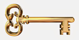
          The Silver key is actually part of Lucy’s imagination so I decided to use a collaboration of styles to illustrate it. Its nozzle (similar to a USB device) is a sign of the technological world in which the characters are living because Lucy may be imagining beyond the reality but at the same time she’s part of it. The screws are inspired by steam punk stylistics – the forms and curves are elaborated. Besides they often are reminding of a surreal and fantastic but at the same time of something old and already experienced. The two added holders on the left and on the right also refer to the old classical vintage key shapes. In brief the key model is a mix of futuristic, oldschool futuristic and vintage. Here I’ve posted some of the models I was using during the creation process of my silver key. 
Rose, L., 2009. Futuristic key - maybe makes you able to fly?
[digital image]. n.d. Available at:
http://www.fashion-illustration.eu/2009/11/key-o
f-space-and-time.html
[Accessed 30 November 2009 ]

Luxury, N., n.d. Futuristic key [digital image]. Getty Images. Available at:
 http://www.gettyimages.co.uk/detail/photo/futuristic-key-royalty-free-image/96251971
[Accessed n.d.]

n.d., n.d. Power Key - DrPanda Survivor ORG Wiki [digital image]. n.d.
Available at: 
http://dict.space.4goo.net/dict?q=key
[Accessed n.d.]
And this is my imaginary silver key, drawn following the rules of product design with real dimension - upper, down and sided view:

Friday, 29 November 2013

Storyboard - analysis and drawing

             The Storyboard drawing was one of my favourite parts. Due to my previous experience in terms of shot marking and script analyzes I managed to create one good standart (except the drawing level)12 shots storyboard on a 3A format sketch book which needed couple of small corrections . The storyboard is illustrating the conversation between Lucy and Jim in Jim’s flat which I classified as the fifth scene of the screenplay after Lucy’s dream, Lucy’s waking up, the exterior scene with the key and the Communication booth scene. I chose that scene in particular because of its importance of the whole story. Before that fifth action the contradictions of the main character had been only cursorily hinted behind the signs of the lively dream, the tear and the silver key. By way of contrast, on the storyboarded scene the female character for first time shows her inner conflict by involving the other main character – Jim in it. Thus, here we have 2 opposite sides of life. Jim who lives in peace with the similar recurring forms of reality, using every time the few possible clips which are the options and on the other hand, there is the burning rebel heart of Lucy who wants to leave beyond the framed same old reality. In fact, this part of the story delineates a whimsical portrait of the characters and an everlasting context of each epoch. However, in this scene in this there could also be noticed a collision of three very strong feelings – passion, anxiety and apathy outlining a absorbing collaboration which could be shown in the movement of the characters and their look in front of the camera.


Constructions

Novak, M., 2007. n.d. [digital image]. Blogspot. available at:
http://paleo-future.blogspot.co.uk/2007/02/mars-and-beyond-1957.html
[Accessed 28 February 2007]
               After illustrating my people's daily life on the red planet, on of the first task which suddenly appeared was their possible construction of building. This forms will be essential during the technical draughting of the sets. However, most of the research for future living constructions on Mars include multi-box flat structures, domes and some go a lot further beyond the imagination drawing high narrow buildings made of mixed oval and square shapes with sharp tops. I led my decision choosing domes, despite their disadvantages in terms of fitting furniture in oval halls, to the fact that they are very typical and even with their simple shapes they often automatically linked in observers associative mind with either Eskimos or spacecrafts. Thus, multi-box structures aren't quite representative and are often often used for most of the buildings on Earth. On the other hand,the third variation seems way too complicated in evolution level which is inappropriate because action encompass the first years of human settlement on Mars.
Bruce, W., 2010. n.d. [digital image]. Blogspot. Available at:
http://appliedimpossibilies.blogspot.co.uk/2010/10/building-first-generation-of-buildings.html
[Accessed 28 October 2010]
Infinite3dfx [pseud.], n.d.. Martian City [digital image]. Turbosquid. Available at:http://www.turbosquid.com/FullPreview/Index.cfm/ID/284415
[Accessed 2 Novermber 2005]

The story


           The Carcass screenplay at first seemed a bit unclear to me so as an artist I decided to add some narration to the story which could explain characters’ behavior. I researched some Science fiction subgenres while concluding which direction is the most appropriate in my point of view. The main idea was to present the story in way similar to our current presence but at the same time as a part of a totally different reality. For that reason, I decide to exaggerate some current fears about the futuristic computer society by sending my characters on a Mars and creating their “robot” society there with a total lack of nature. Later on, I found out that there’s already much information about eventual Mars human settlement one of which is planned for year 2023 and there are already more than 200 000 applicants for it. This massive project is sponsored  by Dutch entrepreneur Bas Lansdorp and proposes some structures and possible solutions which were quite useful, but this will take part in the next post. However, I decided to include this story in the background as a unsuccessful despite the high interest and in my opinion it’s most likely to turn into a failure for two main reasons. First of all, it’s part of people’s behavior to lose interest after they get what they wanted. Now it may sound as the highest possible point of an adventure, but later when they alight on the red planet, everything would look completely different. On the other hand, if you imagine just for a second having the same old view while looking through the windows wherever you are, won’t be quite hard to realize how monotonous would it actually be. Though, my story starts after the flop of this first expedition when the characters has been sent as part a special second expedition which does not consist of so transparent action. People have been secretly injected a liquid which cost their loss of memory and are enabled to express any complaints and organize riots about their eventual returning to Earth. Thus, this prevent step is taken to avoid any other unsuccessful expedition which had already cost a great financial losses.

Al Khan, M., 2014. "Dubai resident shortlisted from more than 20,000 people for Mars One mission"[online] Available at: http://www.thenational.ae/uae/science/dubai-resident-shortlisted-from-more-than-20-000-people-for-mars-one-mission [Accessed 5th Jan 2014]

Tuesday, 26 November 2013

Design For Carcass

            Our first designer student work includes a set design for the short film script "Carcass". The greatest advantage of the whole project is our freedom of creativity. The lack of frame in terms of period and style requirements of the design gives us the freedom to rely on our own imagination. The only point we should follow is to present the narration in a futuristic way.  Looking through the script in depth I decided to create my own schedule during the design process departing it to 4 week paths.
           1st Week: Developing a story for the story; Storyboarding & initial script work
The characters of the story are expressing strong feelings and emotions which differs them from each other but nowhere does the author mention details about the world around them and their reason to behave the way they do. I decided to come up with a background story to order the missing pieces of the puzzle while at the same time clearing my own attitude about the characters. In addition, some basic script work was done too.
           2nd Week:  Research and Prop visuals
Through the second week I focused my research on constructions, forms and shapes suitable for the appended narration. The analyzed information was also vital for my first drawing work on some prop visualizations.
           3rd Week:  Draughting, Drawing and again Draughting
This third path was the most exhausting part of the whole process. Draughting different sketch plans and imagining the cameras movement has to be quite precise which makes it usually taking hours in front of the paper or on the computer.  Visual drawings of some parts of the sets are also essential because of the required details for that illustrations. Basically, this period compassed most of the technical part of set designer’s job - drawing working sketches, sketch elevations and some set visuals.
           4th Week:  Design for a Book, a Presentation and a White model.
Last week passed through a Photoshop trainings . A work-in-progress book was required so designing its templates took quite a lot of time. Thus, creating and formatting the final PowerPoint presentation of the whole process and a white model of a set which was also some activities left for the final stage.

Sunday, 10 November 2013

Volunteering for Embody Art Performance


The dance performer which was broadcasted on a large screen installation.
              Practice is an important part of every educational process, especially when we talk about creative courses in the field of photography, design, film, etc. While books and articles teach you some essential rules already delineated by the best professionals before you, the real involvement in a production could not only combine and maximize your scope of theoretical knowledge but also underpin the bases of your own style and its influence on the contemporary forms of art. For this reason, as a design student, the first thing on my MA activity list was to take action. This happened to be my volunteering period in Embody - an MA student collaboration with Dance4, part of the October dance festival. Producers of this event were Ali Northcott who is a current MA student and Becky Bailey, assistant producer in Dance 4. The performance consisted of dark 3 rooms through which the observer should pass through by taking off his shoes on the entrance. One of the rooms was completely dark, the second one had a big screen built on one of the walls and the third one had lamps. On the screen was projected the dance of the artist from the picture above and there was an female actor which participated in the action from the third room. There was one participant allowed in each performance and afterwards it was repeated with again with the next guest. This performance stimulated the participant to experience a unique connection between an artist and art forms.
             Throughout my assistance in that performance I was still far from  determining my future contribution to the design scene but I managed to gather some initial tips which could be useful for every future artist without experience while planning a similar low budget event:
1.              1. The team consists of 3 groups of people –producers, technicians and volunteers. Producers (can be one or more) are responsible for the whole performance and how it should look like which basically includes everything – idea, set design, order, stage costume, performance schedule, etc. They are the bosses and they conduct the rules starting from the writing and inventing of the scenery and end with the realization. Technicians build the set structure – lighting, installations and stage or in other words all the technical work. And finally volunteers which can play a very essential role during the realization and the presentation of the story. They are most often students who are taking a related subject at the university so they need to acquire experience before they could apply for future job, so they desperately need to get involved in anything practical enriching their CVs. On the other hand, volunteers can be more helpful than a producer would expect. In my case we did technicians assist, acting in the performance, cutting and sewing some props, shopping, cleaning and many roles as part of the backstage support.
2.           2. Don’t reject any help. As I already mentioned – there is quite a lot of work to be done so never reject some assist from volunteer, especially for the backstage support. It’s hard to calculate exactly how many people will be needed before the very last minute. Our team consisted of around 7-8 people including the producers, but always keep in mind that unpredicted circumstances can occur.
         3.Avoid confusing the observer. Producers should always imagine how an observer will see their performance, in particular when it requires the spectator to be in an active role (so he becomes a participant). The more objects you use, the harder it gets for him to use them  especially when you expect him to do it in a current way. So, my point is that a producer should always use signs to display how he is expecting his project to be performed. I can depict this rule with an example from Embody. The final room of the performance had 3 doors  and some of the people were opening the wrong one and entered the backstage which was quite awkward for all of us. It probably wouldn’t have happened if there was a sign showing the way out. However, these circumstances could rarely be predicted and sometimes it’s hard to illustrate participant’s desired movement using signs compatible with the interior design and the atmosphere of the presentation.

My role as an assistant

  • I was responsible for the initial shopping of props including safety pins, flannels, towels,etc.
  • Preparation of the art space (The Bohunk Gallery) for the performance - cleaning, building the sets.
  • During the performance I took the position of a curtain manager. My work was to hold the curtain while the actor passes through them (4 or 5 times for each participant) without revealing anything from the backstage.